
Two streams of conscience at once. Can there be such a thing?
Reading some notes I made in Camera Lucida by Roland Barthes, one note from the margin stands out in particular, “the onslaught of photos is creating a world of indifference rather than reacting to it – thereby preventing the photographer to escape it or even learn to accept it.”
Beacon, New York is a small city located on the Hudson River, in Duchess County. It is one of the many Hudson River Valley towns dotting its banks from the northernmost tip of Manhattan to the city of Troy, New York approximately 140 miles to the North.
I’m not sure what it is of late, perhaps it is a physiological occurrence, but I am seeing colors differently in photographs. That is to say, I am taking note of color in photos ever since purchasing a photo book of Saul Leiter photographs. Saul Leiter helped identify, along with the famous art curator Jane Livingston, a group of photographers in New York known as the New York School of photographers. There are many well known photographers included in this Leiter/Livingston described group: Diane Arbus, Robert Frank, Bruce Davidson, Helen Levitt, etc.. Some of the photographers associated with the New York School of photographers were members of Magnum Photos, a cooperative founded in 1947 by Robert Capa, Henri Cartier-Bresson, David Seymour, Maria Eisner, George Rodger and William Vandivert. The photos produced by these greats need no introduction, but a study of their aesthetics and content is a course in photography.Wikipedia indicates that billionaire Michael Dell (founder of Dell Computer) has a venture capital firm that acquired a collection of 200,000 present prints of images taken by Magnum photographers since many its members through the years were photojournalists. I think it says something that the entrepreneurial class has taken notice of the value of these prints. So goes the value of photos goes the city of Beacon.
Originally settled in the late 17th century and then occupied by Europeans in the early 18th century, the city of Beacon was originally two villages which combined late in their relative histories (early 20th century). In the 1800s this early trading post became home to the light industries of hat making and later, a factory that printed Nabisco boxes. Access to rail and the Hudson River were the most likely strategic factors contributing to the Beacon economy.
Back to color. When I purchased the Sigma Bf camera, I thought I observed, and perhaps this is purely psychological, color photos that were rich and vibrant yet contained a subtlety of tonal variations that, to my eye, made them…beautiful.(My Saul Leiter book purchase came after the camera purchase, btw). Now, before anyone jumps to the conclusion that I’m an oaf when it comes to digital sensors, processing, color science, etc… I must come to my own defense and tell you that I understand that the processing of any RAW photograph can, with enough manipulation and edits, match any another. So I do understand that is POSSIBLE. But the truth is that we all pick our equipment to produce results we like based on the setup of hardware and software we possess or purchase. Side bar check, this is not a discussion of gear and equipment.
You would think, given its history, that I’d have taken pictures of hats or boxes when walking around Beacon, but the thought never occurred to me. Come to think of it, I don’t remember many hats being displayed in clothing store windows and the old Nabisco box painting factory has been repurposed into the Dia Modern Art Museum. You see, artists have come to Beacon and given it a continued life and purpose.
While the city of Beacon is typical of many Hudson Valley early industrialized towns, a history that includes references to the original Native American population (land purchased from Wappinger Indians, hence the nearby village named Wappinger Falls), its current form shares architecture made of locally sourced bricks (local clay and kilns), 19th century buildings, a small local library, a local municipal building of some colonial architectural style, a local theater etc. and the usual local historic landmark, in this case, the Howland Cultural Center designed by Richard Morris Hunt. Mr. Hunt was the architect chosen by famous patrons during the gilded age, such as the Vanderbilts, who constructed homes as monuments to their social standing and financial success.
Again, back to color. I have been trying to see the world in color (yes, this is a ridiculously sounding statement for someone who isn’t color blind or a dog) these past 3 months. Color can bring focus to a photograph, it can encourage the eye to wander. It can lure us with subtlety or smash us with its boldness. It can change the way we feel about the subject captured. What it doesn’t do, is simplify the process of taking a picture. It is quite the opposite. Color can COMPLICATE THE SHIT out of photography. For many photographers, this is addressed by trying to unify the color palette of a photograph either through subject matter, post-processing or both. I will nickname this the Unified School of color photography. Then there are photographers that take photos with certain biases established by the equipment and medium used at the time. While I have no proof of this approach, I would argue that Saul Leiter was very aware of his photo choices based upon the camera, lens and film he was using when shooting his New York City street scenes. As you can imagine, when considering color in the equation, the possibilities of the “what” and the “how” to create/process a photograph become large influences upon the artist and rather complex. Black and white is challenging enough for most photographers, color makes it just “that much” more challenging.
Beacon isn’t particularly colorful, but it has a certain charmed grit. Like many small towns that are in a constant act of reinvention, it has the coffee house, brunch vibe thing going on during Saturday and Sunday mornings. The diner still feels authentic. Locally sourced beers are served in bars. A choice of nice restaurants with interesting menus caters towards both the sophisticated palette and the simpler one. Second hand clothing shops and record stores fulfilling the resurgence of vinyl music playback are scattered along the simply named “Main Street.” Sidewalks are decent sized widths and the scale of the place feels comfortable, with a slight hint of its once former importance to a niche industry revealed by its restrained but ornamented architecture having a substantial appearance.
Back to Barthes’ comment about photo prevalence and indifference. Is there a saturation point with an artistic media that yields to indifference? Music (jazz modalism or bebop) or painting (impressionism or expressionism), for example? Was Barthe eerily prescient 50 years ago -that with the invention of the camera phone many years later (a device practically owned by almost any traveler in the world today)- the world would become indifferent towards photos? Contrary to Barthes’ claim, it seems that with almost every traveler holding a camera phone, there has been a renewed interest in photography and its proliferation. I would argue that for many, it has become second nature to whip out a phone for a pic. The photographic enterprise has been renewed with greater interest than ever before. Let us rejoice.
Families walk the sidewalks joined by many dog owners and from what I could gather, consist of a mix of ages from the young toddler to the senior citizen (the people, not necessarily the dogs, though these appeared to vary in age as well). The city leans to the artsy side with a bit of the Doc Martin, leather jacket chic for some seniors and twenty somethings poking out from street front entrances leading to apartments above. In my imagination, these residents seem pitted against a group of colorfully haired, tattooed and nose ringed residents (or visitors) whom also choose to display their sense of style and individuality. It is the kind of Main Street liberal atmosphere where people feel free to express themselves without judgement and fresh thoughts are brewed as often as the select coffee beans from the artisanal coffee shops in town. One should keep in mind, it is the Dia Art Museum along with the art-culture of Beacon that has led it from its post industrial demise to current desirable state. The power of color.
But there’s a catch.
This newfound interest in photography is not necessarily for the sake of the end result of the photo itself, but instead, the usefulness of the photo to share in a different experience: social media. As camera phones introduce photography to those using social media to communicate shared experiences, their importance as a tool for communication has grown, not diminished. Photography as a documentary or artistic enterprise has transformed into blur of both. The quality and execution of the photograph being taken is used in so much as it can enhance the social media experience. The goal of photography for the social media influencer, communicator or general user, is no longer the painstaking process of its execution and origination, but rather, the teleological experience of its re-purpose somewhere else.
Light bulb moment: the difference between the origination of the photo and its use or influence is the teleological phenomenon that also describes the moment a photographer snaps a photo and it is transmogrified from photographers work apart from the indifferent one in which he operates, to the indifferent and objective world in which he can only inhabit but never fully be a part of…
When I was in college, I began taking up the hobby of photography by using my father’s old Nikkromat camera, the story of its provenance which has been part of family lore for years. The story goes that my father purchased the camera on his honeymoon, much to his new bride’s chagrin as he split his time with his new toy with that of his new wife. By doing so, he also spent the money that would otherwise have been used for dinners/spoiling themselves, for an interest he could only excuse by taking numerous pictures of his reluctant new bride. So, there’s that: many slides of my mom in Puerto Rico. Thanks Dad. The lesson most learned in pursuit of taking and developing my own photos was that black and white developing was easily learned and financially approachable by a college student while color photography was, as per my recollection, a shit show of chemicals, costs, papers, multiple processes and failure.
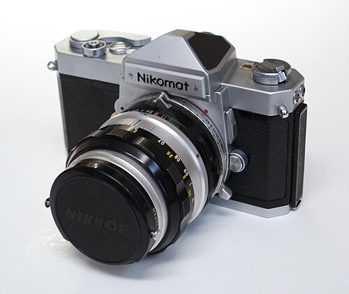
But where does color play in all of this? That Nikkromat FT took great photos. Colors with Kodak film or Fujifilm, and the Nikkromat 50mm 1.8 lens were wonderful. In fact, I used this 22 year old camera (at the time) to document my travels through Europe in the summer of 1989. Is the use of color a way to distinguish ourselves as photographers? What does this really mean? Color certainly has little effect on indifference to photography, or does it? I will argue that the iPhone’e implementation of computational photography, which includes its color science, has done the opposite of Barthes’ claim: it has renewed interest in, and encouraged exploration with, color photography. In so doing, the iPhone has made everyone think DIFFERENTLY about the photos we take and the reasons (some inspirational, others not so much) for taking them. It has provided us with a new way to literally observe and “react” to photographs, albeit in a less traditional sense compared to the pre-camera phone days. Then again, what is a camera phone if not the camera you carry with you everyday?
Housing around the Main Street is located on small building lots with shallow setbacks, 19th and 20th century porches and views of the nearby mountains primarily from modest homes built in an American field home style borrowing heavily from the original Victorian style homes that still exist near Main Street.
My new appreciation for color in photos is refueling my interest to develop RAW photos and compare them to the OOC JPEG files. Ultimately, I love the control of developing RAW photos into my own personal vision of what I want from digital “film,” and this, in turn, is a large part of what it means for me to take a color photograph. My general feeling is that digital photos “boost” color profiles when compared to film (vividness) and therefore influences the photographer in their approach to creating their art. Like any comparison between digital vs analog reproduction, the differences arise from the way each medium expresses its limitations when trying to reproduce an infinite spectrum of shades, tones or timbres. In the audiophile world, the best reproduction is considered the one truest to the live sound of music. Some audiophiles emphasize soundstage (atmosphere, instrument placement, ambience, air, sound around instruments) as the convincing criteria to compare to live music, while another group of sound hounds are convinced reality starts with the complex tones and timbres of the instruments themselves. Photography has had the luxury to have more easily abandoned this fool’s game: photographers do not necessarily obsess on the ability of a camera or film to achieve the “truest” representation of the original. Achieving nuanced shades, light and color gradations is important for many, sure, but to compare to the original? Not so much. It seems the philosophy of color or color science is grounded in the lexicon of viewing photography as an art form rather than a re-creation of a performance. Perhaps the photographer can be likened to the recording engineer…and there is much to be said of this analogy. Perhaps when performers control the recording and mixing process of their recordings, they are introducing creativity into the process by which the analogy of the artist and photographer is more convincing, each trying to present an artistic vision of two different realities: one created by them or the one presented to them.

Leave a comment